| assets | ||
| cover.png | ||
| LICENSE | ||
| manifest.json | ||
| README.md | ||
| theme.css | ||


Programming Mono
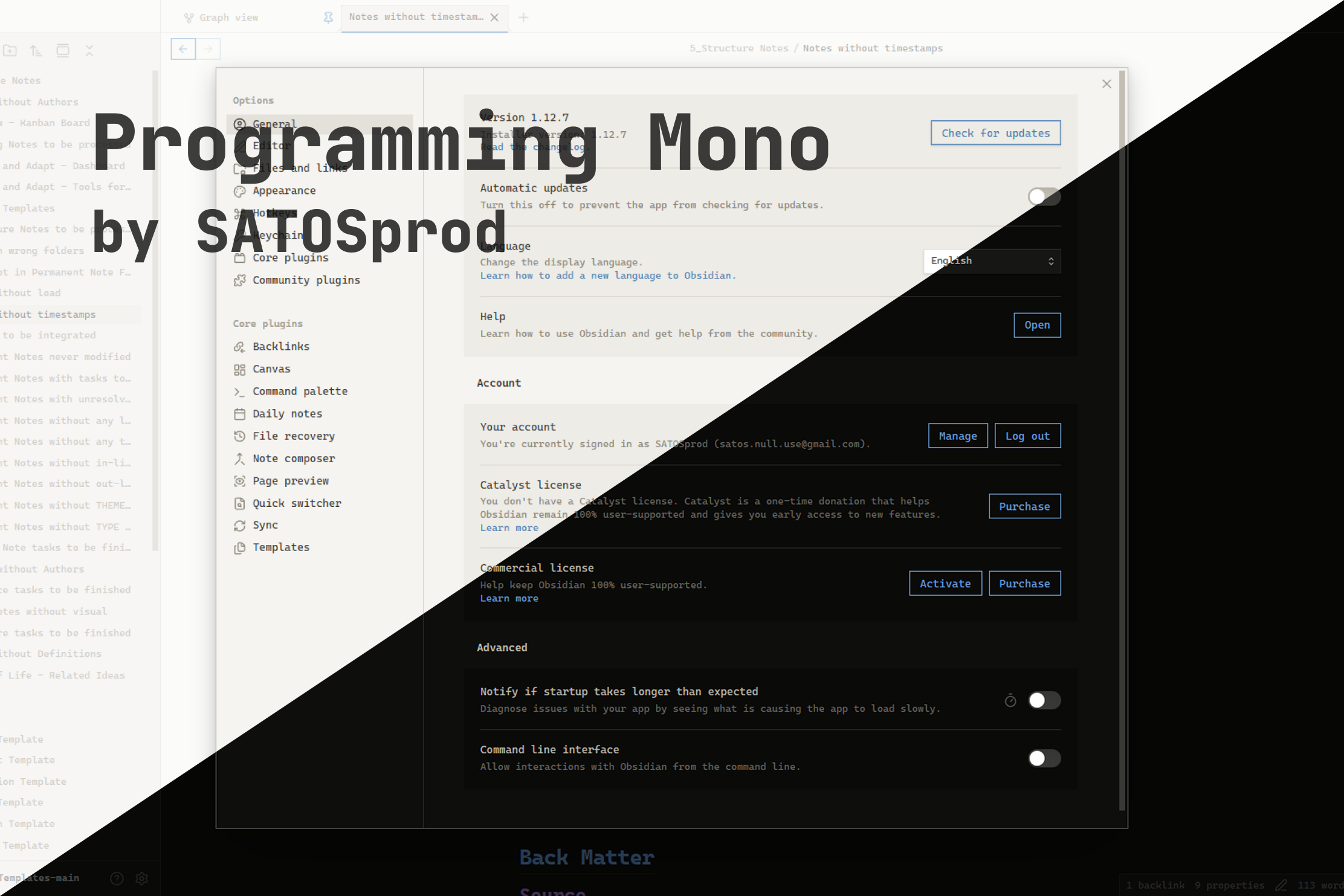
A sharp, monospace Obsidian theme built for programmers — zero border radius, JetBrains Mono everywhere, and a restrained syntax-inspired accent palette for both dark and light mode.
Author: SATOSprod
License: Proprietary — see LICENSE
Preview
Why Programming Mono?
Most Obsidian themes are built around rounded corners and a proportional UI font, which feels out of place for anyone who spends their day in a code editor. Programming Mono flips that: every corner is square, every font — interface, text, and code — is monospace, and the accent colors are picked to double as a readable syntax-highlighting palette. The result is a vault that looks and feels like an IDE.
Features
- Full monospace UI — interface, editor text, and code all use
JetBrains Mono(falls back toFira Code,Cascadia Code,ui-monospace) - Zero border radius — buttons, tabs, inputs, modals, panes, and scrollbars are all perfectly square
- Dark and light variants — both built from the same warm, low-contrast neutral palette
- Four-color accent system — headings H1–H4 each get a distinct accent color, reused consistently across links, tags, and code syntax
- Syntax-highlighting-aware colors —
--code-keyword,--code-string,--code-function,--code-comment, etc. are mapped so inline code and code blocks read like a real editor - Flat, minimal chrome — no shadows, no gradients, no rounded pills — just borders and flat fills
- Custom scrollbars — square, low-profile scrollbars matching the rest of the UI
Requirements
- Obsidian 1.7.2 or later
- Works on desktop and mobile
Installation
From Community Themes
- Open Settings → Appearance → Themes.
- Click Manage next to Themes.
- Search for
Programming Mono. - Click Install and use.
Manual installation
- Download the latest release from the Releases page, or clone the repository:
git clone https://github.com/SATOSprod/programming-mono.git
- Copy the theme folder into your vault:
<your-vault>/.obsidian/themes/programming-mono/
├── theme.css
└── manifest.json
- Open Obsidian → Settings → Appearance → Themes and select Programming Mono.
Usage
- Install the theme using one of the methods above.
- Open Settings → Appearance.
- Under Base color scheme, choose Dark or Light — Programming Mono ships full support for both.
- Under Themes, select Programming Mono.
- For the full intended look, pair the theme with a monospace font family such as
JetBrains Monoinstalled on your system — the theme already references it by name and will fall back gracefully if it isn't installed.
Color Palette
Dark mode
| Role | Color |
|---|---|
| Background | #0e0e0c |
| Background alt | #161614 |
| Code background | #0a0a08 |
| Border | #282826 |
| Text | #b8b6ae |
| Text high | #dedad0 |
| Text low | #686660 |
Light mode
| Role | Color |
|---|---|
| Background | #f5f4f1 |
| Background alt | #ebe9e4 |
| Code background | #eeece7 |
| Border | #d8d5cd |
| Text | #3a3934 |
| Text high | #1c1b18 |
| Text low | #8a8778 |
Accents (shared hues, adjusted per mode)
| Accent | Used for | Dark | Light |
|---|---|---|---|
| Accent 1 | H1, links, functions, tags | #6a9ed4 |
#4a7fb5 |
| Accent 2 | H2, keywords | #a07cc8 |
#8a63a8 |
| Accent 3 | H3, strings, properties | #89c87c |
#4f9a44 |
| Accent 4 | H4, warnings, important values | #c06f6f |
#b05a5a |
Configuration Notes
| Element | Behaviour |
|---|---|
| Corners | All corner radii (--radius-s/m/l/xl, buttons, tabs, inputs, checkboxes) are forced to 0px |
| Fonts | --font-text-theme, --font-monospace-theme, and --font-interface-theme all resolve to the same monospace stack |
| Headings | H1–H4 use the four accent colors; H1 also gets a bottom border, H6 is uppercased and letter-spaced |
| Code | Inline code and code blocks use a dedicated background with a syntax-colored token set (--code-keyword, --code-string, --code-function, --code-comment, --code-tag, --code-value) |
| Links | Standard links use Accent 1; unresolved internal links use Accent 4 |
| Tags | Rendered with Accent 2, a soft tinted background, and a matching border |
| Buttons | Flat, bordered, transparent background; fill with the accent color on hover |
| Scrollbars | Square, theme-matched thumb and track colors for both modes |
File Structure
programming-mono/
├── theme.css
├── manifest.json
├── assets/
│   ├── 1.png
│   └── 2.png
├── cover.png
├── LICENSE
└── README.md
How It Works
- The theme defines a small set of raw palette variables (
--bg,--bg-alt,--bg-code,--border,--text,--accent-1..4) separately for.theme-darkand.theme-light. - Every Obsidian CSS variable (
--background-primary,--text-normal,--interactive-accent,--code-*,--h1-color…--h6-color, etc.) is mapped from that small palette, so the whole theme can be re-tuned by editing a handful of values. - A second block of rules forces
border-radius: 0across buttons, tabs, inputs, modals, and panes to enforce the theme's square-corner identity regardless of Obsidian's own defaults. - Syntax-relevant variables (
--code-keyword,--code-string,--code-function,--code-comment,--code-tag,--code-value,--code-property) reuse the same four accents so inline code, code blocks, and headings feel visually consistent. - All rules are scoped under
.theme-darkand.theme-light, so switching Obsidian's base color scheme swaps the full palette instantly with no extra configuration.
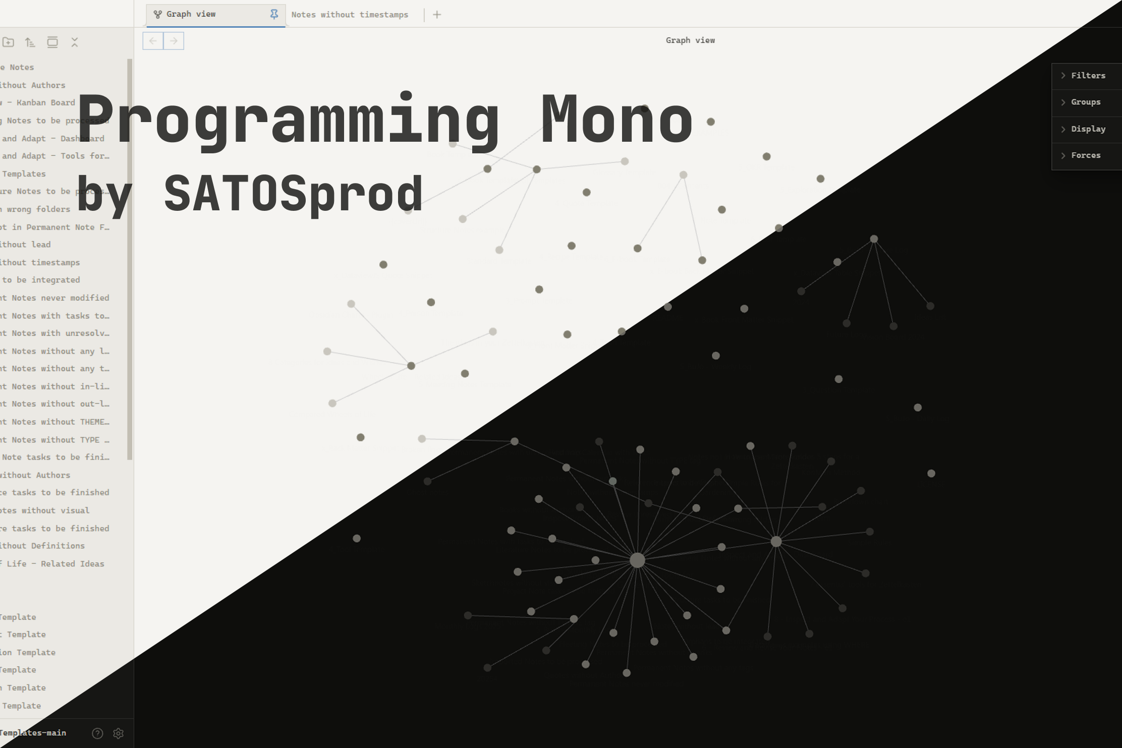
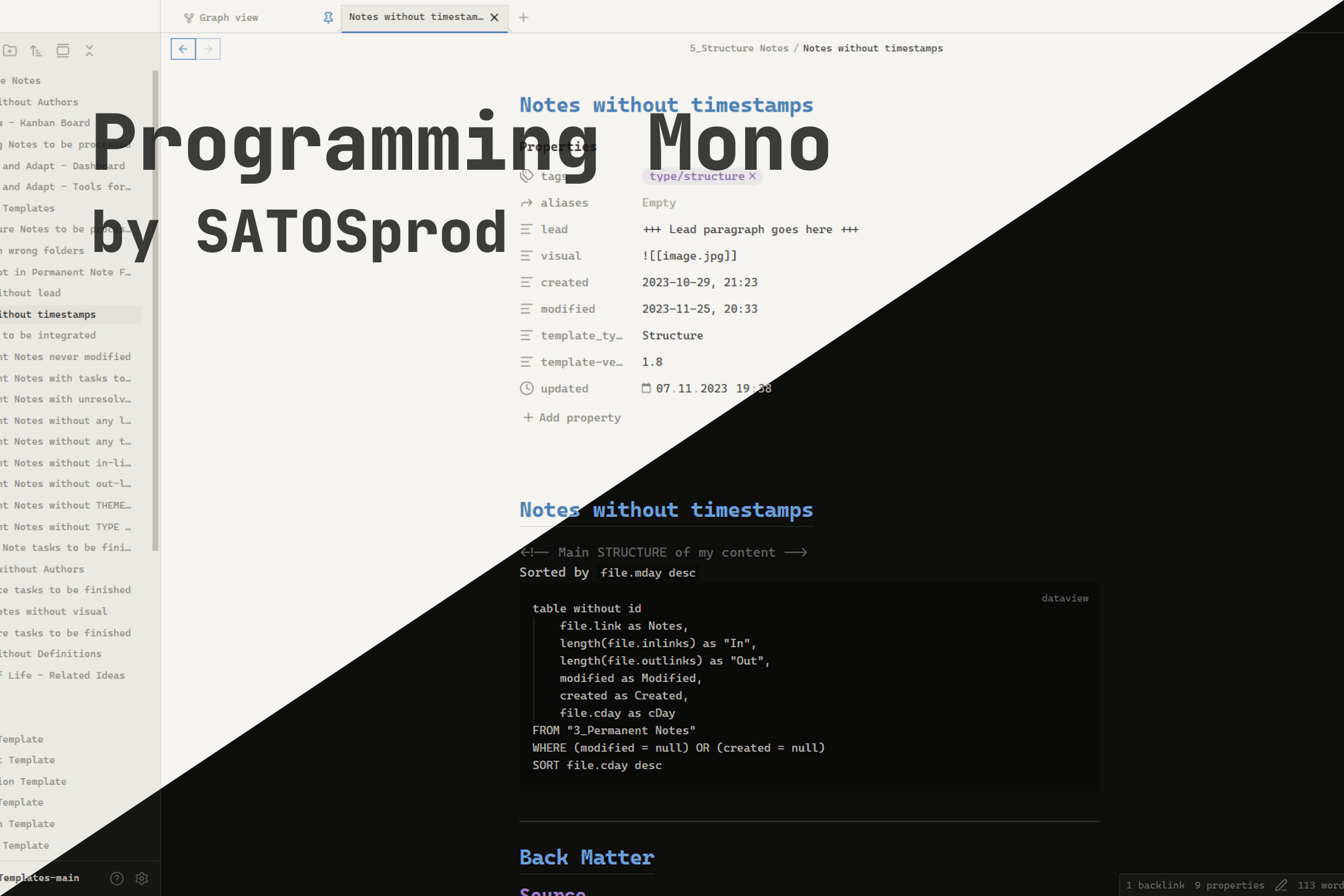
Screenshots
License
This project is released under a proprietary license.
Copying source code into other projects is not permitted.
See LICENSE for full terms.
© 2026 SATOSprod